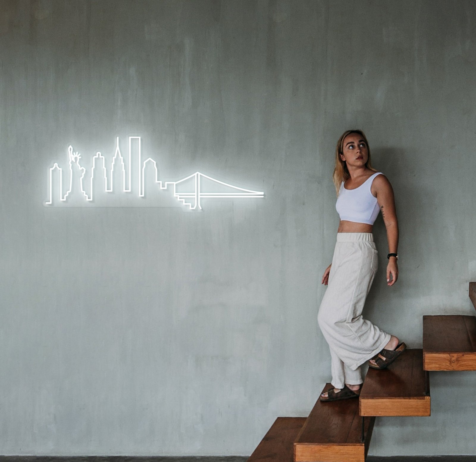
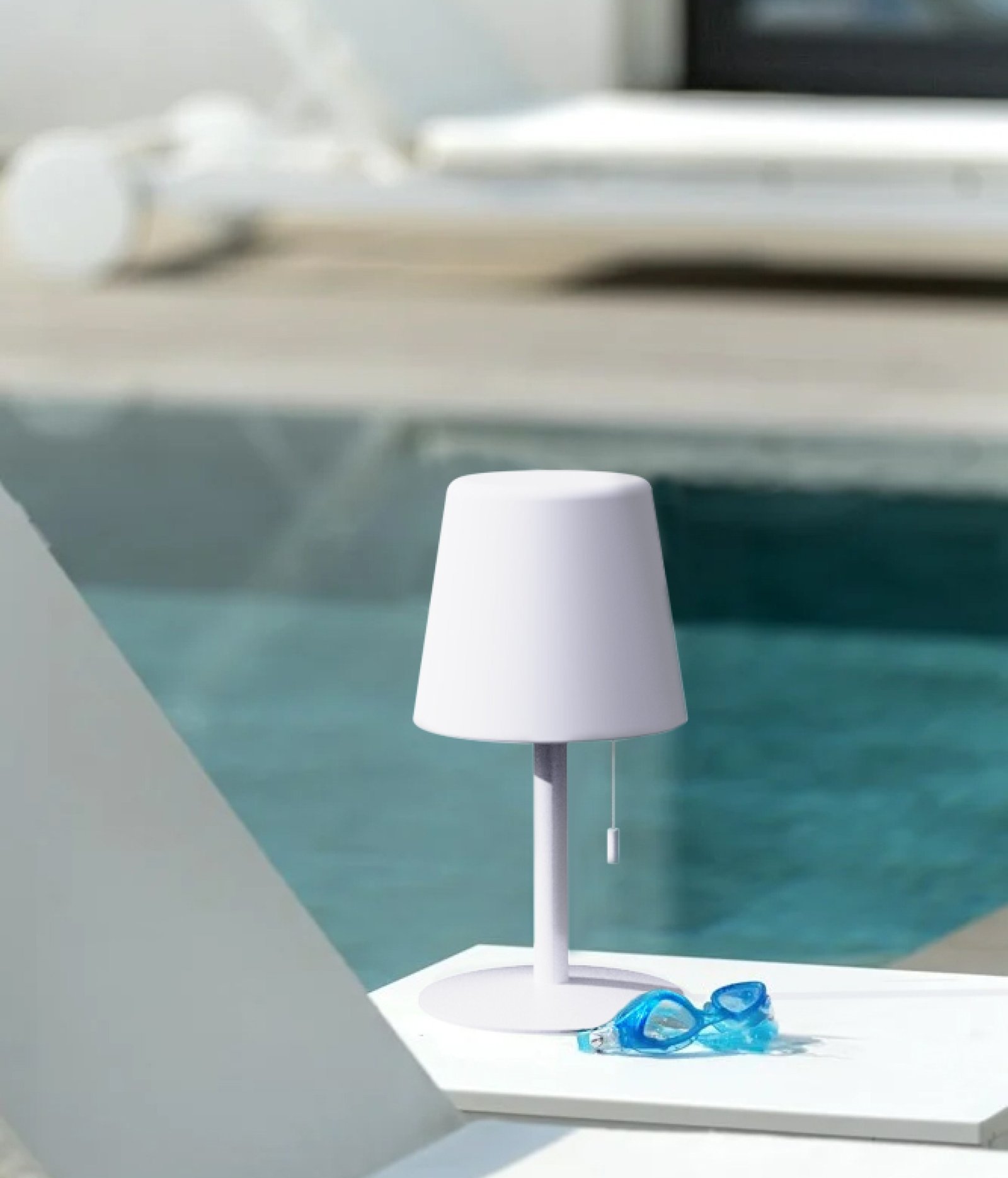
We consider it the handkerchief in our pocket, the precious texture on the porcelain plate, it’s when you see Mars when staring at the starry sky.

Brief
Candyshock was conceived during a trip to Hong Kong in 2019. We were travelers in a foreign country, where we barely knew the language but were eager to discover innovations (and eat noodles). Every night we explored the city until we fell in love with a neon sign outside a restaurant. Nobody knew what it meant, but we wondered if the restaurant, without that detail, would have had the same energy.
And all of a sudden, a flash... so to speak!
Why couldn’t we create details too? Why couldn’t we create personality pills that would change the characteristics of an environment with the simple movement of the finger: ON - OFF?
That was precise moment we thought of Candyshock, we barely mentioned it and the name wasn’t this, but the energy was the same.
With Candyshock’s signs you say something about yourself without speaking, you show your personality with a light touch.
Logo
The Candyshock logo takes inspiration from the classic and much-loved spiral lollipop. Here it is stylised and recreated as if it were a long LED tube.


The colour chosen for the logo is not just any pink, but a pink reminiscent of the famous shocking pink of Elsa Schiaparelli. A strong colour, full of personality, which also lends something of its name to the brand.


Products


Small | 40cm

Medium | 80cm

Large | 110cm
Make your favorite neon centerpiece or create beautiful compositions with paintings, photos and objects to make your room unique, bright and colorful!


Packaging
The packaging is in cardboard material and is available in 5 different sizes, depending on the size of the product.

CREDITS
THE TEAM
Head of Design: Michel B.
Graphic designer: Eleonora G.
Product Designer: Diego T.


