We wanted to keep the feeling of lightness, softness, coziness; Qushini is a story that speaks for you and is told by us.

Brief
The project was born in 2017 while, during an interesting trip to Hong Kong, we stumbled on a shop in the center where we saw an electronic product wrapped in a silicone design shell.
Do you recall that warm feeling that only some things in your home can evoke? That’s exactly what we felt in that precise moment, as if, even though we were 12.000 km away from our beloved Italy, we had a piece of home at our fingertips.
This ecstatic emotion that lasted all day was the trigger that finally convinced us to invest in Qushini, this amazing brand that made us feel the home warmth even when far.
Logo
Qushini takes its name from the Italian word “cuscini”, which means pillows. The softness and lightness that this name conveys is transformed into a stylised feather.

The font is neat and essential, strategically constructed as a fundamental element of the brand identity. It also provides an indication of brand positioning, thanks in part to the choice of colour.


Products
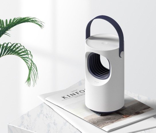
The research for the catalog’s products keeps going until 2018 and includes nice, functional and design accessories, with simple lines and pastel colors, in a lively and delicate packaging that present them all in a clean way.


The key factor for each Qushini product is to be that extra "something", that object that you didn't know you needed, but you can no longer live without.


Packaging
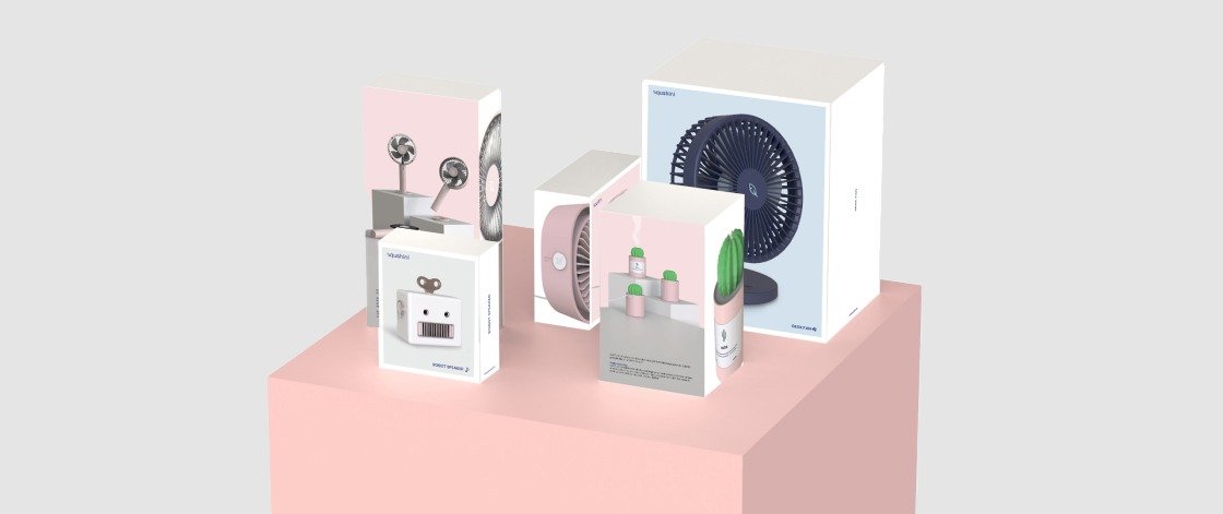
The careful selection of products, as well as their characteristics, are mirrored in the packaging. The creative process takes account not only of the contents of the boxes and the brand in general, but also the target market.
This packaging makes it possible to stand out from other products in the same category, thanks to the characteristic white colour which communicates the brand’s elegance and lightness. The product is in the foreground on each packaging, providing continuity to the brand!

CREDITS
THE TEAM
Head of Design: Michel B.
Graphic designer: Eleonora G.
Product Designer: Diego T.


